StudioRes, one of Marriott’s newest hotel chains, needed an identity that visualized the brand pillars of simplicity, flexibility, and functionality. I worked closely with the StudioRes team to refine every detail, ensuring the final identity would be innovative and timeless. The visual identity is still in progress, but the images above showcase the logo, known as the “comfort capsule,” and its potential uses. This project was an exciting opportunity to explore minimal design while ensuring the brand’s core values are communicated.

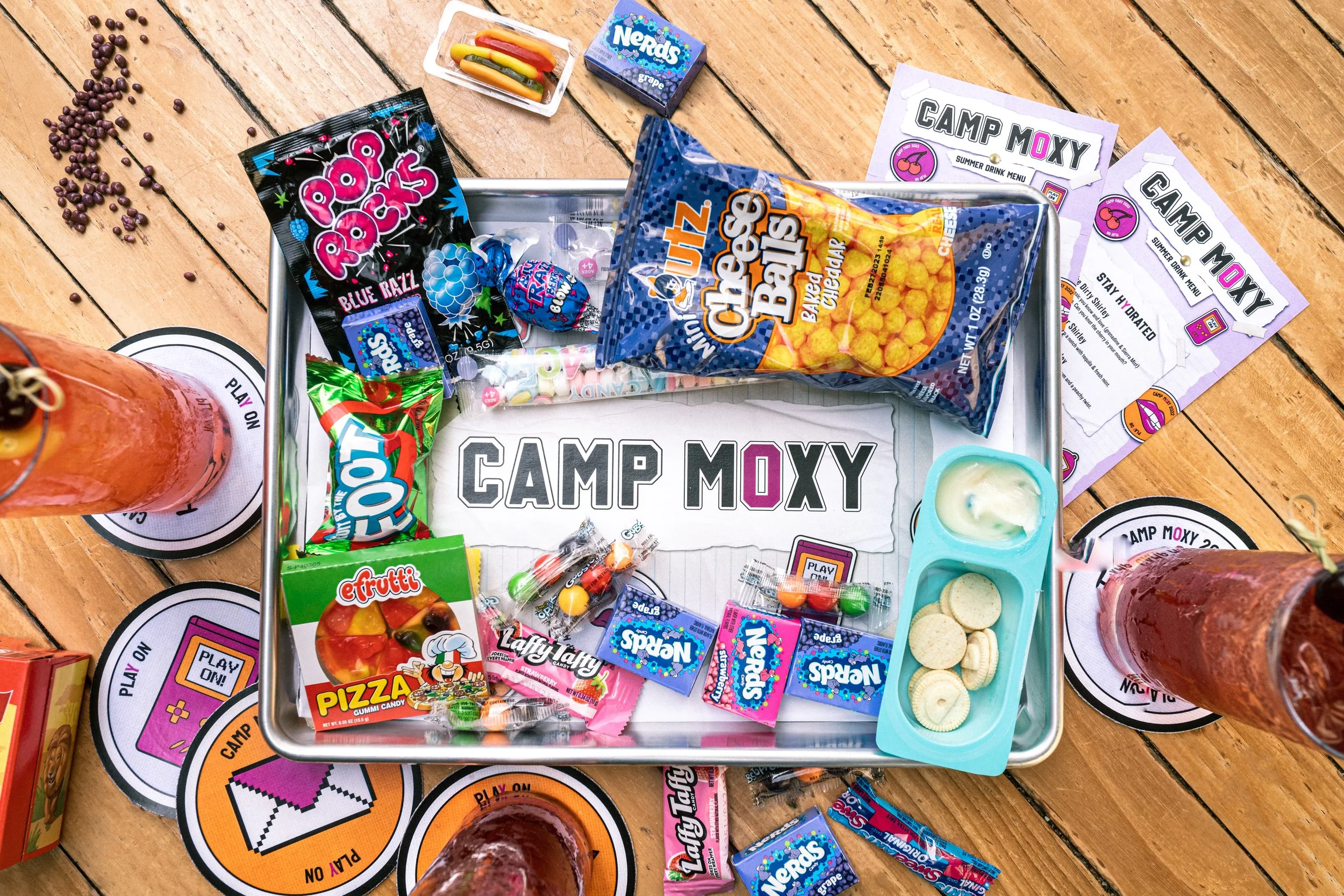
Moxy Hotels requested a concept for a summer event targeting millennials. I designed “Camp Moxy,” a 1990s summer camp-themed event featuring camp and nostalgic 90s visual imagery with the signature Moxy attitude. What began as simple coasters and menus expanded into a limited-time drink menu, throwback snack items, and nightly events centered around the Camp Moxy theme. The event launched in five locations in the summer of 2023: Austin, TX; Chicago, IL; Seattle, WA; and two Moxy locations in New York, NY.

1 Hotels requested a redesign of their minibar packaging that emphasized luxury, simplicity, and sustainability. After presenting multiple design directions, they selected a design that uses vibrant colors, bold typography, and sustainable materials. I designed the packaging in InDesign and created the mockups in Photoshop. Though the client initially requested design directions only, I exceeded expectations with these eye-catching mockups. The products are now under review and pending approval by retailers.

To create awareness and anticipation for new locations in Melbourne, AU, and Copenhagen, DK, 1 Hotels requested hoarding signage that maintained the brand's connection to nature. Each signage design features plants native to the region, blending advertising with natural imagery. I had previously created a series of images for the 1 Hotels brand book that inspired this creative direction. By incorporating regional flora, the signage promotes the new locations and strengthens the brand's commitment to environmental sustainability. This project explores merging nature with modern design, enhancing the visual appeal of the campaign.

1 Hotels explored an AI-led creative direction for an “Alice In Wonderland” advertising campaign. Using Midjourney and Photoshop, I crafted a series of images to illustrate the magical connection between the hotels and nature. Balancing 1 Hotels' minimal luxury style with an experimental twist, I incorporated natural imagery with fantasy elements. Pink was chosen as the primary color to contrast the typical nature-inspired palette, creating a unique and captivating visual narrative. The campaign not only highlighted the whimsical allure of the brand but also engaged viewers with its innovative and enchanting storytelling.

Gaylord Hotels - Teal Coat Initiative

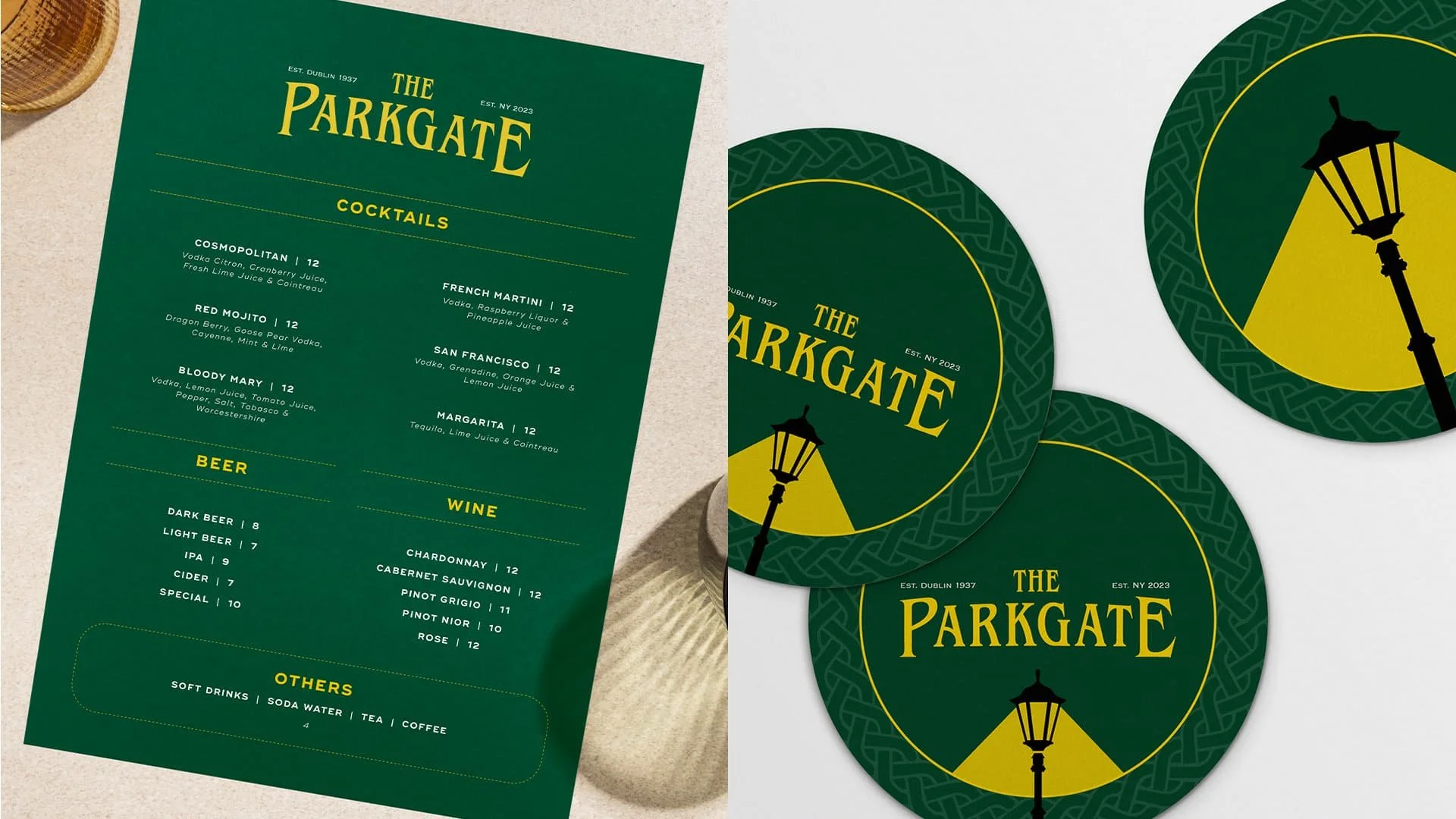
The Parkgate, an Irish bar opening a second location in downtown NYC, inspired this bold visual identity and a series of animations. Drawing from the iconic wrought iron gate and light posts near the original location, I showcased the unique history of the establishment while creating a bold and memorable visual identity.

Aloft Hotels requested a campaign to immerse viewers in the sights and sounds of their hotels. I designed "Aloft Sounds Great," focusing on the key touchpoints of the Aloft experience. Custom illustrations brought the onomatopoeia to life, creating a vibrant campaign.

Choice Hotels - The New Premium

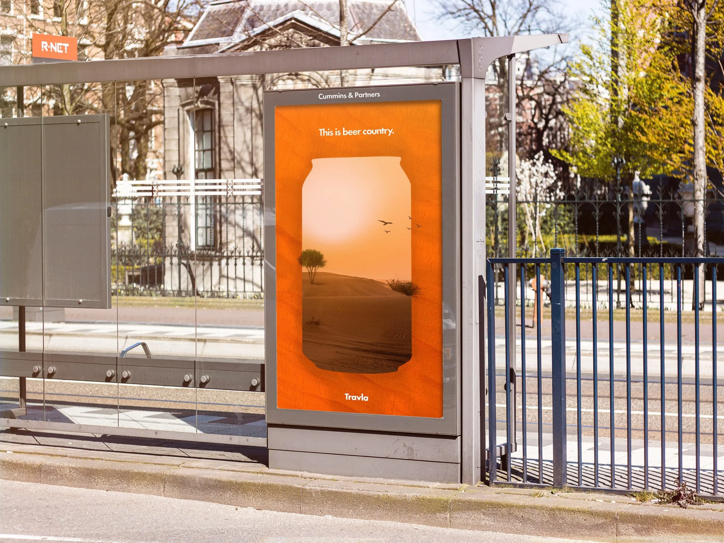
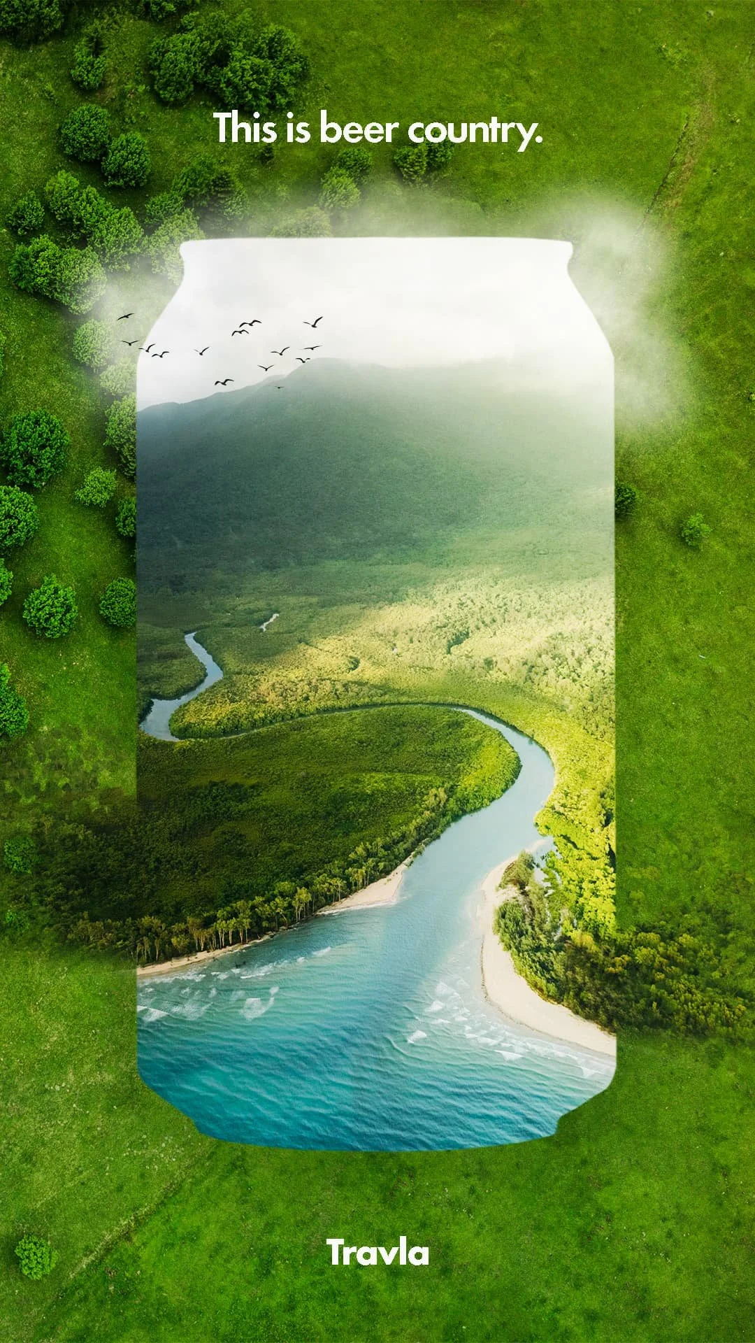
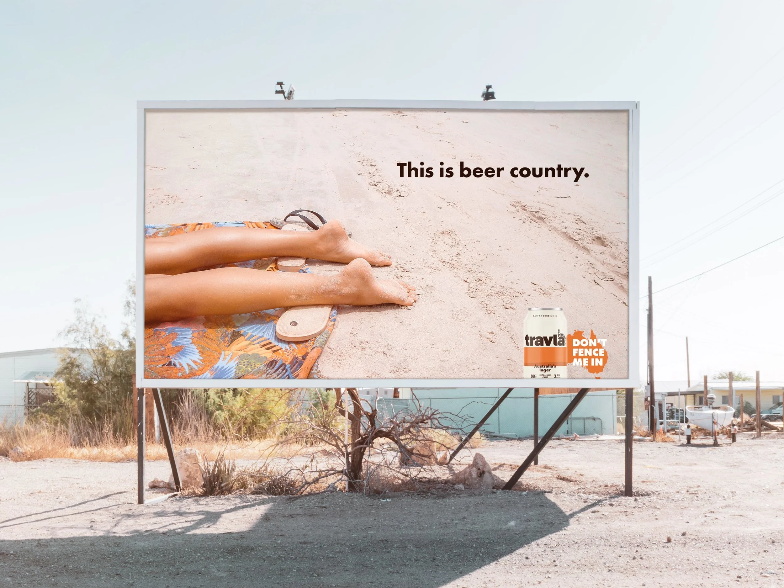
Travla, an Australian beer company, sought to highlight the beauty and diversity of the Australian landscape. I created a series of posters to showcase the connection between the brand and nature, tapping into the Australian people's deep national loyalty and vibrant personality.